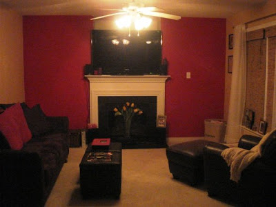
I think this family room has great potential - I love the shades and fireplace. However, it comes off very dark and the TV is a little too overpowering. Here are some suggestions I thought might help improve this family room:
It seems clear to me that this homeowner loves the color red. In order to lighten the room up a little, I'd suggest painting the walls a lighter neutral color and instead, bring in some red through curtains and accents throughout the room.
I love this
area rug for the room. It has a touch of the red that she clearly loves and also has several other colors that she could easily pull out for a paint color.

I like the wooden shades that are already in the room and would keep those in place. Since we'd be going with a lighter wall color, she can afford a darker
curtain with a little more substance than the white frilly ones currently in place.

The room is very dark and could use some additional lighting. Two of these affordable
floor lamps (only $40) on both sides of the couch should do the trick.

As for the television, it's a little large to put above the fireplace. I'd recommend moving it to the wall on a low console table where the couch currently is. The couch could be easily moved across from it in front of the window or put parallel to the fireplace. In its place, I'd recommend a
mirror for above the fireplace and some
vases for the mantle.


Next, in order to break up the abundance of red and black that's currently in the room, I'd recommend introducing some blue (
1,
2) and
tan pillows or throws with the
red.


Last, I'd recommend a few
baskets or storage
ottomans. This will help add some extra storage (and who doesn't always need more?), but will also add texture and will tie in to the wooden blinds already in place.


What do you think?


 Luxy by Heidi

 house to home


 I think this family room has great potential - I love the shades and fireplace. However, it comes off very dark and the TV is a little too overpowering. Here are some suggestions I thought might help improve this family room:
 The room is very dark and could use some additional lighting. Two of these affordable floor lamps (only $40) on both sides of the couch should do the trick.
 As for the television, it's a little large to put above the fireplace. I'd recommend moving it to the wall on a low console table where the couch currently is. The couch could be easily moved across from it in front of the window or put parallel to the fireplace. In its place, I'd recommend a mirror for above the fireplace and some vases for the mantle.